Posted on by sleduc
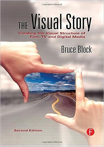
The following information was adapted from Bruce Block’s The Visual Story: Creating the Visual Structure of Film, TV and Digital Media chapter 6 starting on p. 135.
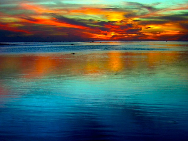
Color, without a doubt, is the most misunderstood visual component. Probably due to the misguided color education we received as children, our knowledge of color and how it works is almost unusable.
Steps
- Create a blog post titled, Contrast and Affinity: Color
- Create the following headings
- Summary
- Terms and Concepts
- Films to Watch
- Controlling Color Production
- What I Learned
- Create the following headings
- Define terms and concepts
- Watch scenes from selected films that showcase the visual structure
- Create a short film that emphasizes the visual structure and embed in your blog post
- Write what you learned
- Include feedback about the film
- Invite someone edit your blog post
- Turn in a blog post feedback form
Terms and Concepts
1. Light
- We use light to illuminate objects
2. Color Systems
- The Additive System
- Remember additive system is mixing light
- Primary colors in the additive system are red, green, and blue
- Red+Blue=Magenta
- Green+Blue=Cyan
- Red+Green=Yellow
- The Additive System Color Wheel

- The Subtractive System
- Remember the subtractive system is mixing pigment, which includes paint and dye
- The primary colors in subtractive system are magenta, yellow, and cyan
- Magenta+Yellow=Red
- Yellow+Cyan=Green
- Cyan+Magenta=Blue
- The Subtractive System Color Wheel

3. The Basic Components of Color
- Hue

- Brightness

- Saturation

- Brightness versus Saturation
4. Contrast and Affinity
- Hue
- Brightness
- Saturation
- Warm/Cool
- Extension
5. Interaction of Color
- Hue and Black or White
- Complementary Colors
- Analogous Colors
6. Color Schemes
- One Hue
- Complementary Hues
- Split Complementary Hues
- Three-Way Split
- Four-Way Split
Films To Watch
- Saturated Hue
- Cries and Whispers (1972)
- Directed by Ingmar Bergman
- Written by Ingmar Bergman
- Photographed by Sven Nykvist
- Production Design by Marik Vos-Lundh
- Cries and Whispers (1972)
- Contrast of Hues
- The English Patient (1996)
- Directed by Anthony Mingella
- Written by Anthony Mingella
- Photographed by John Seale
- Production Design by Stuart Craig
- Punch Drunk Love (2002)
- Directed by Paul Thomas Anderson
- Written by Paul Thomas Anderson
- Photographed by Robert Elswit
- Production Design by William Arnold
- The English Patient (1996)
- Affinity of Hue
- Sixth Sense (1999)
- Directed by M. Night Shyamalan
- Written by M. Night Shyamalan
- Photographed by Tak Fujimoto
- Production Design by Larry Fulton
- The Shawshank Redemption (1994)
- Directed by Frank Darabont
- Screenplay by Frank Darabont
- Photographed by Roger Deakins
- Production Design by Terrence Marsh
- Sixth Sense (1999)
- Limited Color Palette
- Sin City (2005)
- Directed by Frank Miller, Robert Rodriguez, and Quentin Tarantino
- Written by Frank Miller
- Photographed by Robert Rodriguez
- Art Direction by Steve Joyner and Jeanette Scott
- Sin City (2005)
Control of Color in Production
There are many ways to control color: the color palette, filters, time and location, film and digital photography, and the laboratory.
Color Palette
The best way to control color is to limit the color palette itself. The palette means the actual color of the objects (sets, props, wardrobe) in the picture. If you want your finished production to appear red and desaturated, then put only desaturated red objects in front of the camera. Give yourself strict rules about the color of your production and remove colors that are wrong.
A smart production designer knows how to control color. It’s not just wardrobe and wall colors. Ideally the color of every object in every shot should be carefully chosen. This can get overwhelming, so limiting the color palette keeps control simpler and allows the colors being used to have visual meaning for the audience.
The art department can manipulate the color palette. In Peggy Sue Got Married (1986) the vintage look of 1950 Kodachrome photos was achieved by spray painting the grass an unusually saturated green and painting sidewalks purple. In Michelangelo Antonioni’s The Red Desert (1964), everything in a street scene, including fruits and vegetables on a cart, was painted gray.
The color scheme for The Godfather (1972) is basically black, white, and red. So sets, locations, costumes, and props were picked and painted with this specific scheme in mind. Chinatown (1974) has a color scheme based on yellow and orange (the color of dried, parched plants) with an elimination of blue, unless it is associated with water.
Audiences have a poor color memory. If a viewer is asked to remember a specific blue swatch of color, they will be unable to select that blue from a group of similar, but different, blue colors. This lack of color memory can be used to your advantage in the control of color. The hue, brightness, and saturation of an object’s color can be manipulated from sequence to sequence, and the audience will be unaware of the color change. The color of objects can be changed with paint or dye in the same way that lighting changes the brightness of objects. In both cases, the viewer will be unaware of the manipulation.
A color often photographs differently from the way it looks in real life. This problem is called color localization. It occurs if colors change hue, brightness, or saturation when they are reproduced with film, videotape, digital capture systems, television equipment, or printing inks and dyes. The resolution of a computer or television screen will affect localization. A high-definition screen (coupled with a high-definition source) will reproduce colors more accurately than a conventional NTSC television. The manufacturing process affects the color response of various image capturing chips in digital cameras. For example, a saturated yellow flower might appear too bright, and overly saturated, when seen on a digital screen. A group of dark blue hues might appear black on film. Without testing or experience, it’s impossible to determine how a color might shift.
Filters
Placing colored filters on the camera lens and the light sources can control color. This engages the subtractive system. A filter cannot add any color; it can only subtract color. A filter will always subtract its complementary color and transmit its own color.
Lens Filters
Filters can be used on camera lenses. Adding a yellow filter to the lens makes objects in the shot appear more yellow, but the filter isn’t adding yellow. Actually, the filter is removing the blue color (complement of yellow) and the remaining yellow color appears more dominant.
Using colored filters on the camera lens can be tricky. A wide range of standard color filters is available for all types of photography. These filters are extremely reliable and affect the picture in specific, predictable ways. But when other types of nonstandard, colored glass or plastic filters are placed over a lens, problems can occur. The color of nonstandard filters that you evaluate with your eye may not be the color you get on film or video. A nonstandard filter that looks blue to the eye might appear magenta on film, for example. Experience or tests are the only methods of properly predicting how film or digital cameras will react to nonstandard colored filters.
Lighting Filters
Colored filters can be placed on lights. Several manufacturers provide a wide range of colored plastic sheets called gels that are available in any imaginable color.
Placing gels on lights uses the subtractive system. Whenever a gel is placed over a light, the output of the light decreases. The colored gel absorbs its complementary color and transmits its own color.
Standard gels for photography usually are calibrated in degrees Kelvin, and will accurately and predictably warm up (with an orange gel) or cool down (with a blue gel) the color of the lighting. Another group of standard gels are more selective and will remove only small amounts of one specific hue. Nonstandard gels are manufactured for theatre lighting and have no correlation to film or video camera settings at all. Although these nonstandard gels can produce spectacular colored effects, they should be carefully tested before use.
Time/ Location
Color can be controlled by the time of day and the color of the location or environment.
The color of daylight changes as the sun moves across the sky. A sunrise appears more lavender, noon daylight is bluer, and a sunset is redder. Filming during “magic hour” (periods of daylight when the sun is below the horizon) produces an unusual quality of shadowless, blue daylight.
Weather conditions can affect the color of daylight. On an overcast day, the direct rays from the sun (which are more red) are held back by the clouds, making the daylight bluer.
The color of light will also change, depending on the surrounding environment. Colored objects in any location become reflectors and, depending on their size, can change the color of the light.
Photographing near red brick walls will add red to the general color of the light. In a forest, the light that filters through the trees’ leaves is greener than the light coming directly from the sky.
At an exterior desert location, daylight will be reflected off the yellow/ orange desert ground surface. White clouds, acting like huge reflectors, will bounce back the color, making the ambient light in a desert location an even more yellow/ orange color.
Digital Capture Photography
Digital cameras offer exposure controls identical to film cameras, plus many more digital choices. Sophisticated digital cameras have various settings to change the look of the image. Depending on the camera manufacturer, the hue, brightness, saturation, contrast, resolution, sharpness, and exposure latitude can be programmed into the camera. This can radically affect the image recorded by the digital camera. Many photographers prefer to capture
Feedback Form
Posted in Le DucTagged Affinity, Block, Cinematography, Color, Contrast, Film, IB, Story, Visual

You must be logged in to post a comment.